How to usea spreadsheetfor combinatorial creativity
- Tuhin Nair17 min read
Have you ever been wrong while solving a complex problem?
Don't mind me: but of course you have.
Complex problems don't have immediately obvious solutions. They need some iteration, some trial and error, some time and effort before a solution begins to feel right.
Typically, you'd wait for that moment of clarity; maybe when you're in bed or in the shower or on a walk, maybe it'll come to you. A solution that feels especially creative.
But what if you only had 48 hrs to find this creative solution?
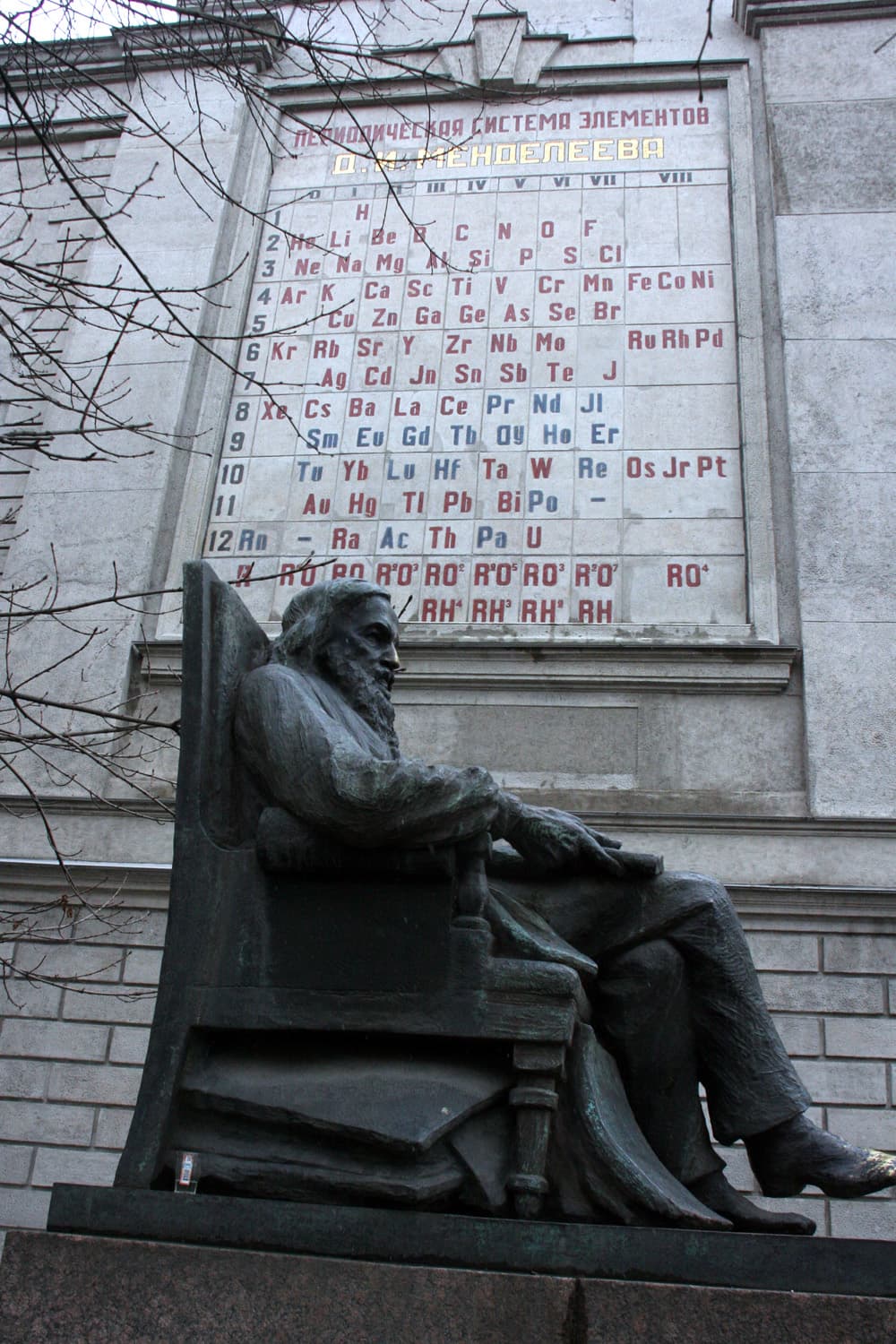
Back in 1869, Dmitri Mendeleev had less than 48 hrs left on his publishing deadline for a textbook (project managers, apparently, are a historically consistent pain in the ass) and he still hadn't figured out how to arrange the elements of Chemistry.
Rumor has it that he cut up cards, wrote the element names and properties on them, and began frantically organizing and re-arranging them to try and find what he needed. Historians dubbed this bit of creative play: "Chemical Solitaire".[1]
Mendeleev did eventually find his prize, and we might even call this prize 'insight'.
But we won't.
We'll call it 'potentially new value'.
Because, in this guide, we're going to see how a spreadsheet helps us quickly find 'potentially new value' by organizing and re-arranging 'existing value'.
To solidify this idea we'll use two fully-worked examples, where:
- We'll wear the hat of an entrepreneur and create a new and useful time planning application.
- We'll wear the hat of a writer and create a new and compelling television show.
But first, whether the story of Mendeleev playing a card game is true or not, why didn't he just use any of the existing tables and diagrams that organized the elements?
What was Mendeleev looking for?
§01
Pattern is why we care about data
AI companies churn decades, many decades, of human sense and non-sense to make their models.
All for the patterns contained in the data.
The patterns within human communication are what gives LLMs their impressive abilities. But why? What is so special about this thing we call pattern? And why was Mendeleev scrambling to find one before his publishing deadline?
At the time (early 1860s) there were 63 known elements (mostly discovered through breaking, burning, or electrocuting things).
Many scientists had tried imposing their way of organizing the elements, creating tables and diagrams that reflected their personal opinions.
But they failed to do one thing.
Teach.
Mendeleev was writing a textbook, and as his deadline neared, he still hadn't figured out how to represent all the elements together in a way that felt good for teaching. It's one thing to list all the elements for his readers, but he wanted some way that would help them grasp why these things were all considered elements. Why did they work as elements? What makes them part of the same category? Why?
At the time there was no established universal law of nature he could use for teaching. And so, whether or not the story with the cards is true: he kept arranging and reorganizing the elements until he found an organization that was ….
drum roll
… periodic.
Periodicity, for our purposes, is a repetition of relationships in specific intervals. Mendeleev had found that the elements were periodic based on the relationship between atomic weight and valency.
Why was this so mind blowing to the world?
Because it explained and predicted things.
Predicted! As in, like, the entire point of all of science. This is why patterns are so valuable. Mendeleev's periodic table not only predicted new elements (correctly!), but also predicted that previous measurements of elements were incorrect (later confirmed to be true).
Mendeleev, oh my, did he know how to make a table, or what?
But what does this have to do with creativity? What is this guide even about? Why does this author almost make me miss my LLM?
Here's the relevant part of the alleged story: Mendeleev found creativity through visual pattern recognition.
So, like Mendeleev, we're going to focus on being able to visually arrange and re-organize things until we spot a pattern. It requires no special knowledge and we'll rely entirely on our current hardware (our juicy brain) to do its thing.
But unlike Mendeleev, we're not looking for one singular natural law or pattern. We have the choice to make a pattern, break a pattern, guess a pattern etc. The possibilities are much larger for creativity.
It's a slightly different way of finding creativity. Instead of relying on a linear narrative or pure associative thinking (like brainstorming), we're going to rely heavily on pattern recognition.
It's still hard work. But it's fast. And if I may say so, bloody effective.
To do all of this, to hold all of our work, we might need some kind of sheet … maybe of the spreading variety.
§02
A matrix builds something complex from something simple
What makes a spreadsheet so special?
Let's talk about llamas for a second. I ask this of my computer sometimes: "Hey, computer, could you show me a picture of a llama?"
Before the existence of AI models, this was a hard request for a computer to understand. A programmer had to figure out how to explain to a (pretty dumb) computer how to show you a picture of a llama.
The programmer would start with something simple.
"Computer, show me a brown dot please."
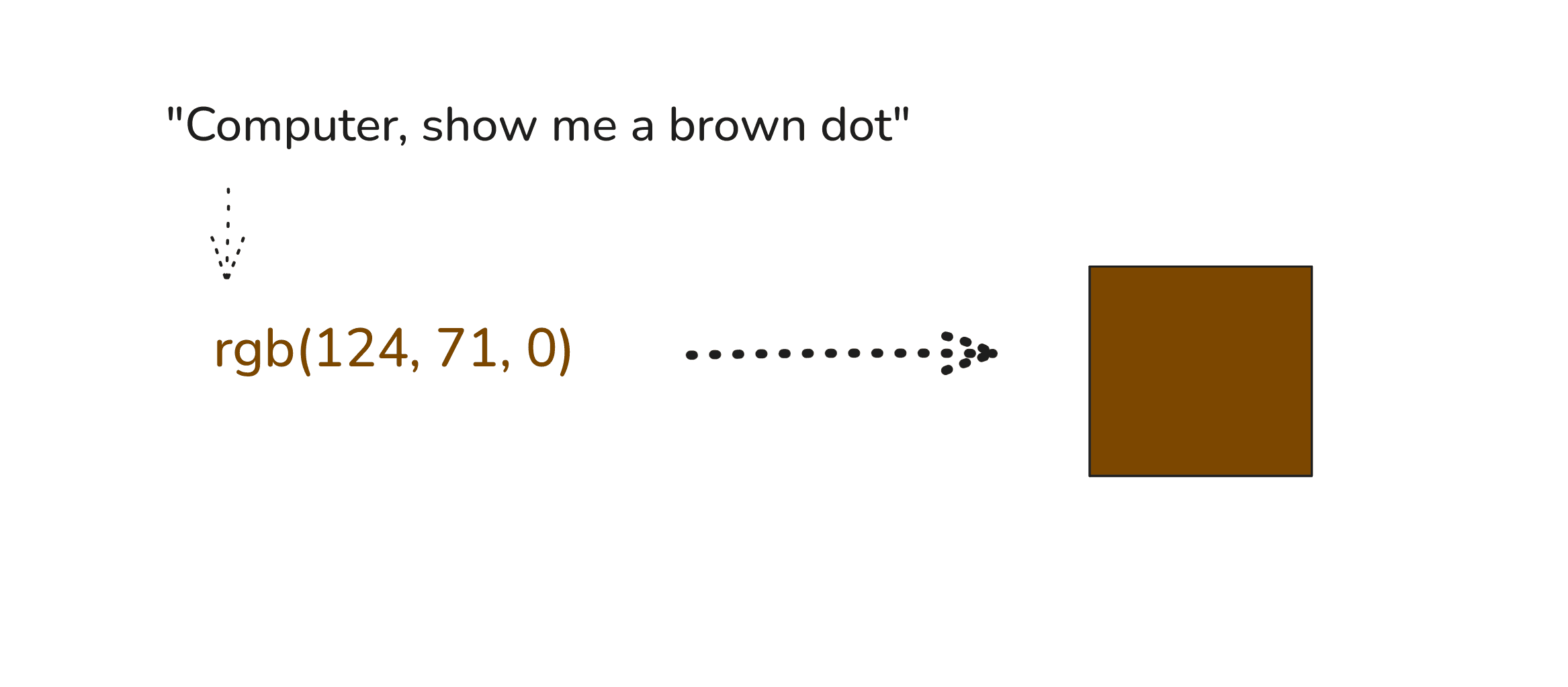
Our dumb computer perfectly understands this simple request; the programmer proceeds to feed it treats.
But not yet a llama though, is it?
The programmer asks for more dots and places them together.
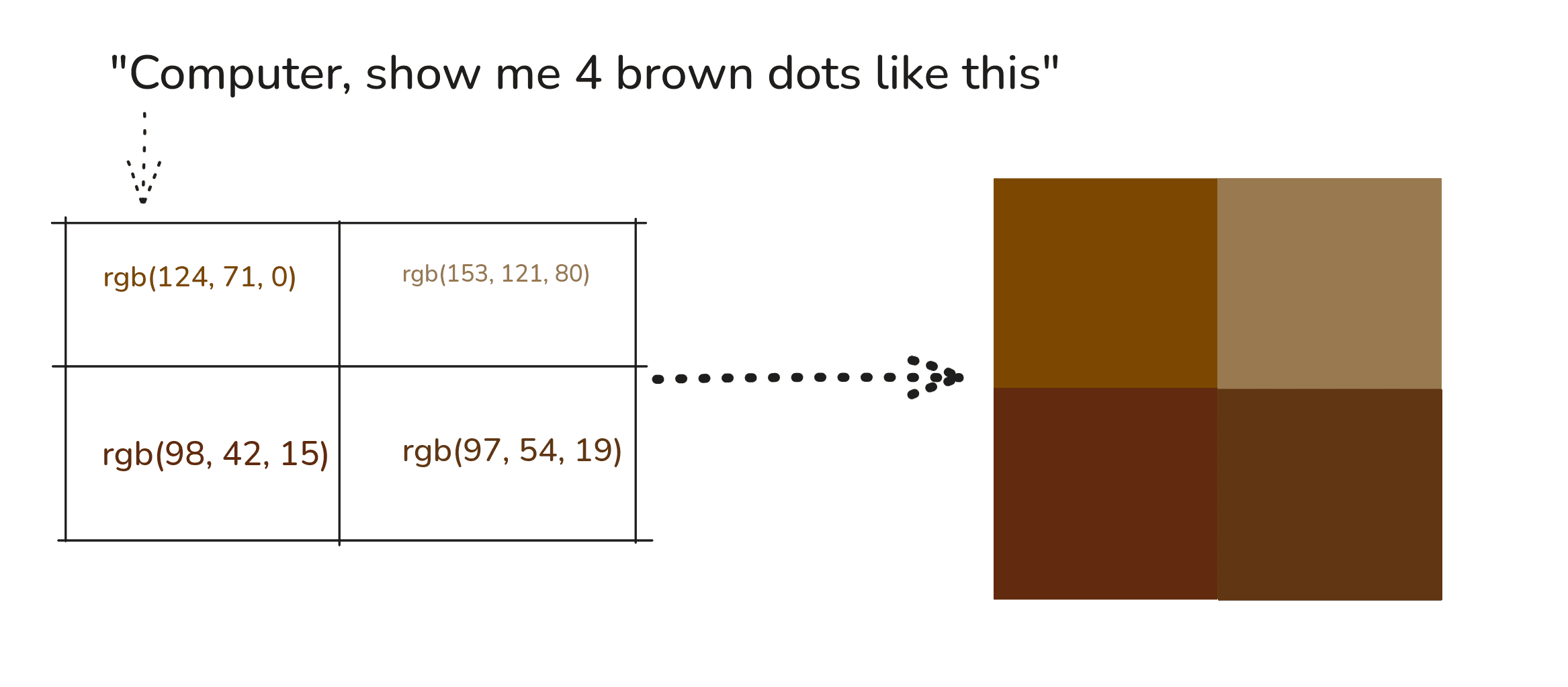
No, still not a llama.
Now, annoyed, the programmer pulls out the secret technique known only to programmers: unnecessary pain.
They ask the computer to color 910 dots, all placed together in a rectangle, all with specific placements. That placement gives us something like this:
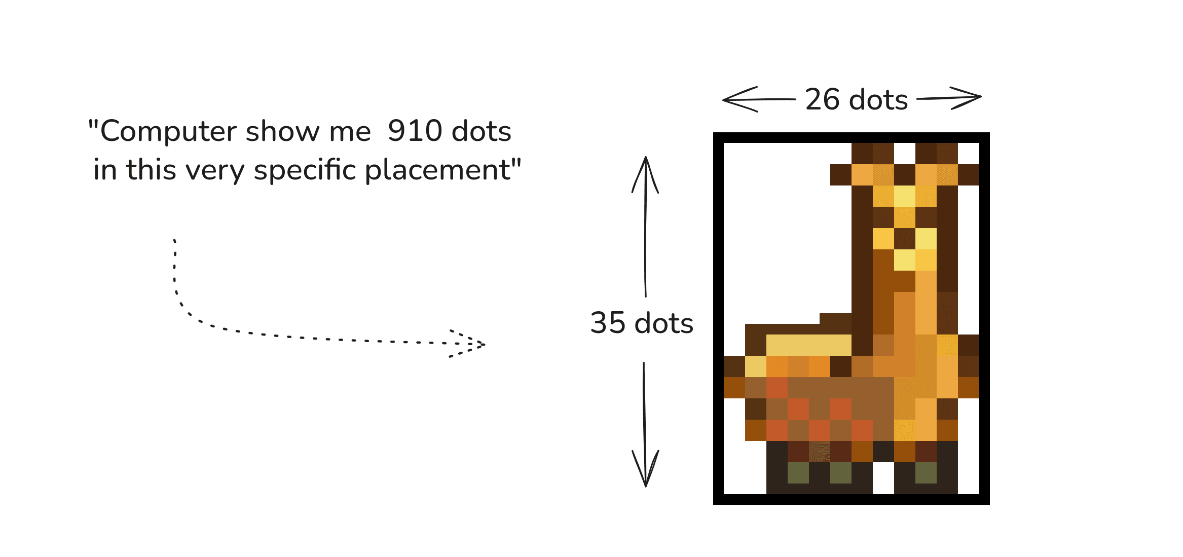
Ahh, maybe llama, I think. Very good, programmer!
The programmer used dots and rows and columns and placement to do all of this. This structure, of taking simple values and positioning them in a grid to create something more complex, is called a matrix.
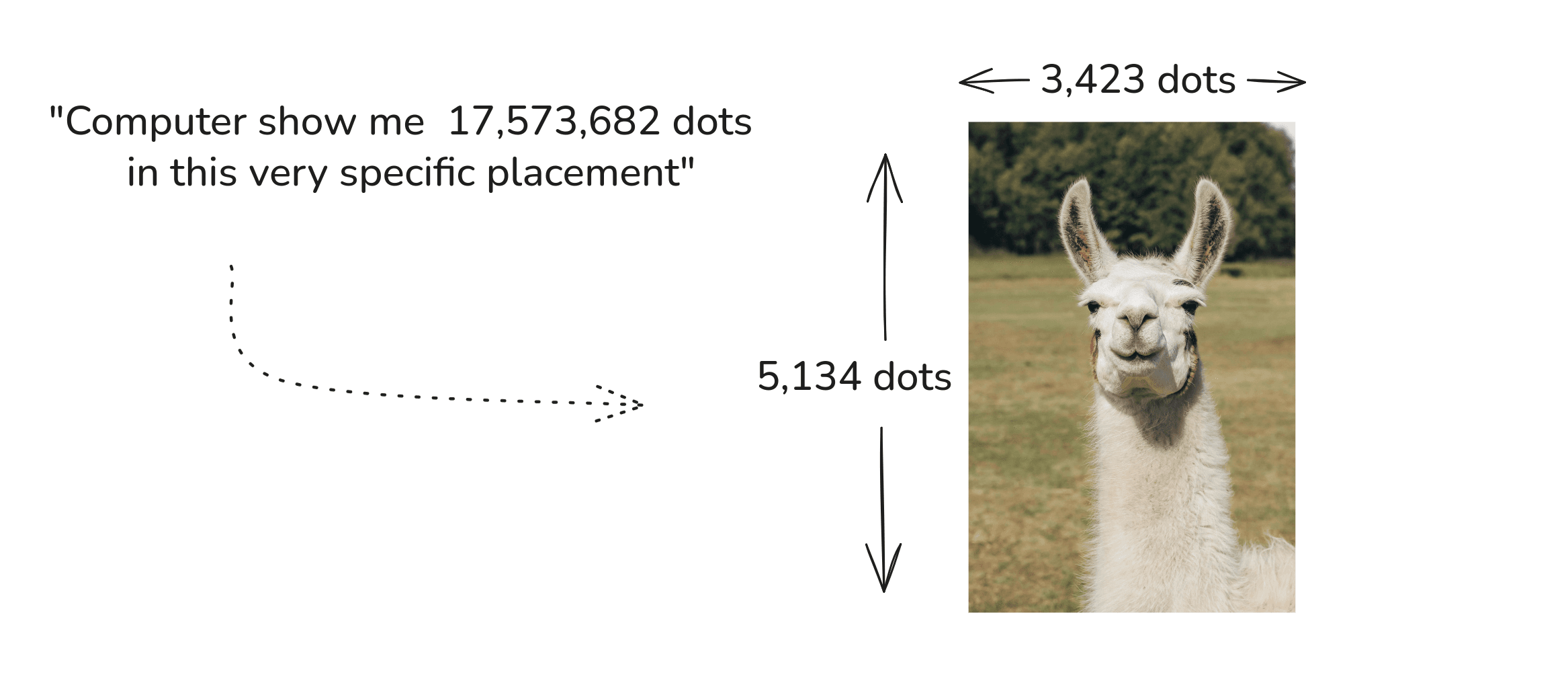
Mathematicians and computer scientists use them all the time. In fact, if we instead took 5,134 rows and 3,423 columns and specified a color for all the 17,573,682 dots, we could get something like this:
Still, how does this make the spreadsheet special?
You know that magical property of math where you can use it pretty much everywhere? Like you can take the idea of "1 and 2 and 3" and use it to count both your sheep and the number of toes you have? It means we have the ability to give it meaning depending on where we use it.
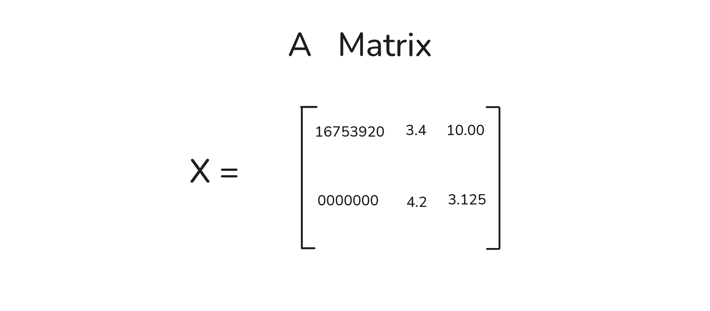
Similarly, if you're like me and have math related migraines, this might initially look like a bunch of intense mathyness:
But a data scientist could do something beautiful with this: they could use it to mean your cats.
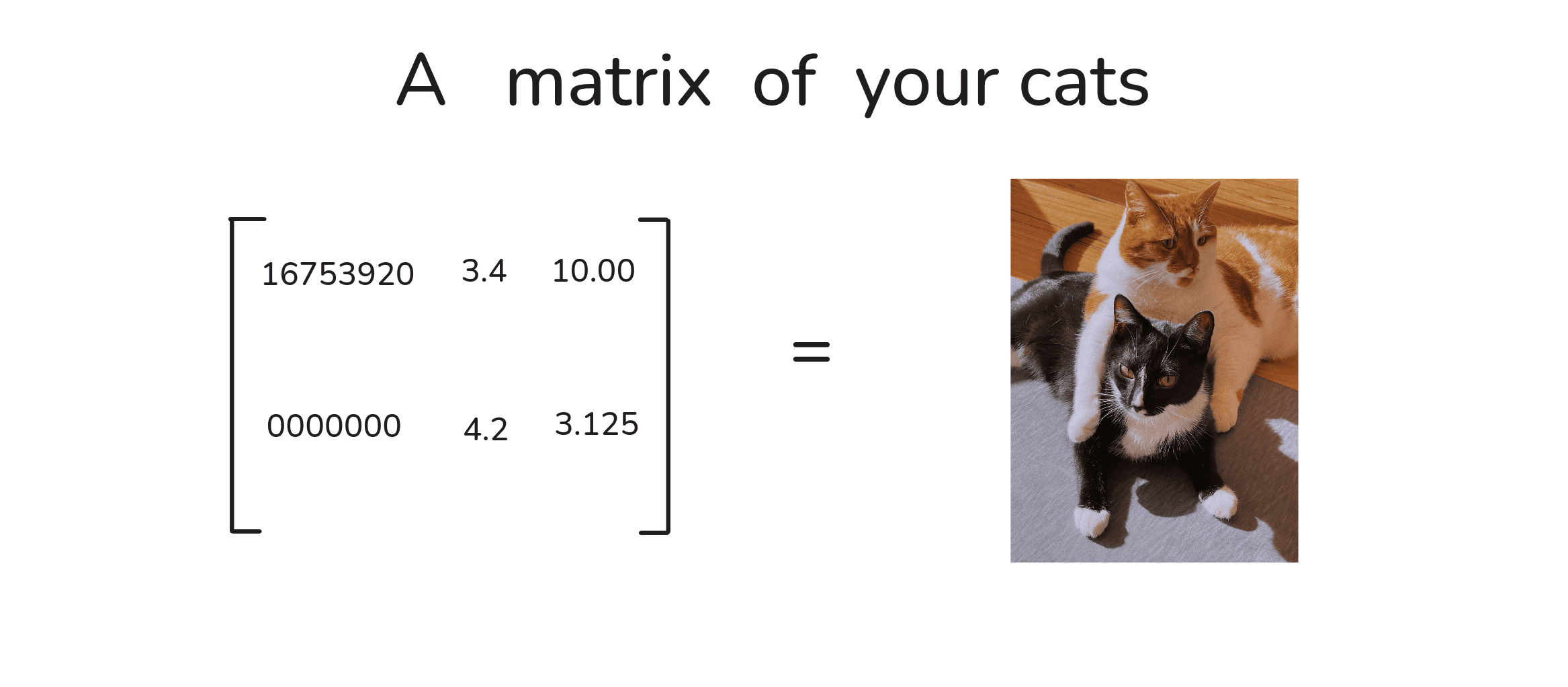
How did they get this rectangle of numbers to mean your cats? By giving the rows and columns specific meaning.
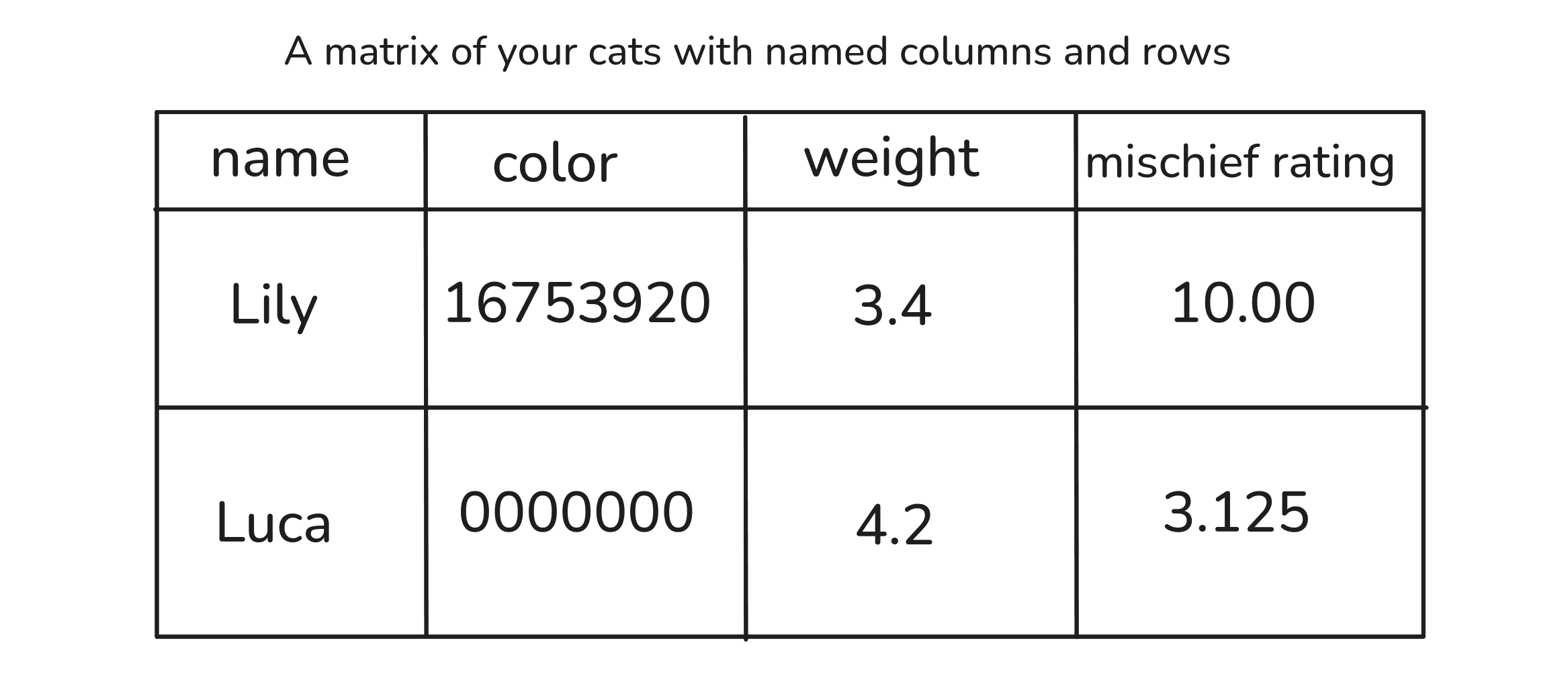
Still too many numbers, I think.
Luckily, data scientists only insist on using numbers for everything because computers have an easy time with them. For our purposes, we can use different scales; simpler ones like labels and feelings.
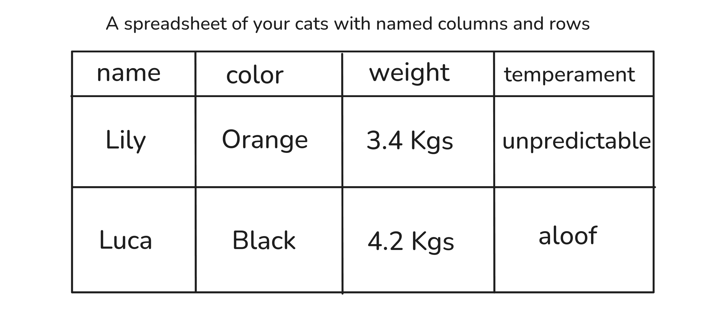
Ok, there's my point: A spreadsheet is a matrix. And just like we did with the llama pictures, we can use it to represent very complex things by organizing very simple things.
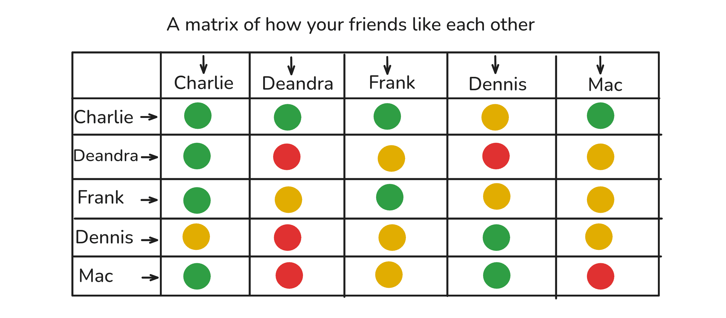
Let's say you have 5 friends (don't worry about me, I actually enjoy bouts of painful jealousy):
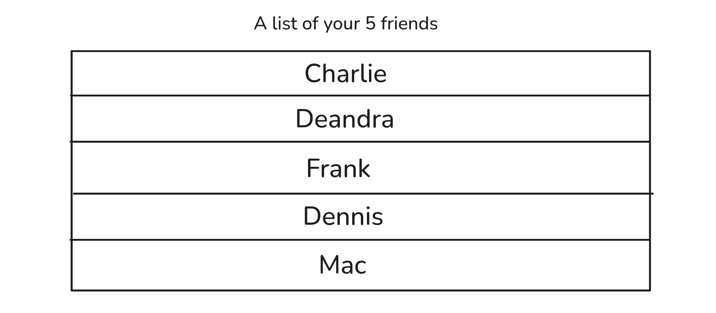
This is a spreadsheet of how your friends like each other:
By giving the rows and columns and cells specific meaning, and by using simple values to fill the cells one-by-one, we've represented the complexity of your friend group.
It allows us to ask and answer questions like 'who's most liked?', 'who's the most neutral', 'who has only a few but very strong friendships'?
Likewise, you could do the same thing to see how the parts in your computer interact with each other or how the characters in your novel relate to each other.
There's something useful happening here.
But what exactly is it? What is the matrix doing? And more importantly, what is it forcing us to do?
§03
Viewing complexity as recurrent patterns
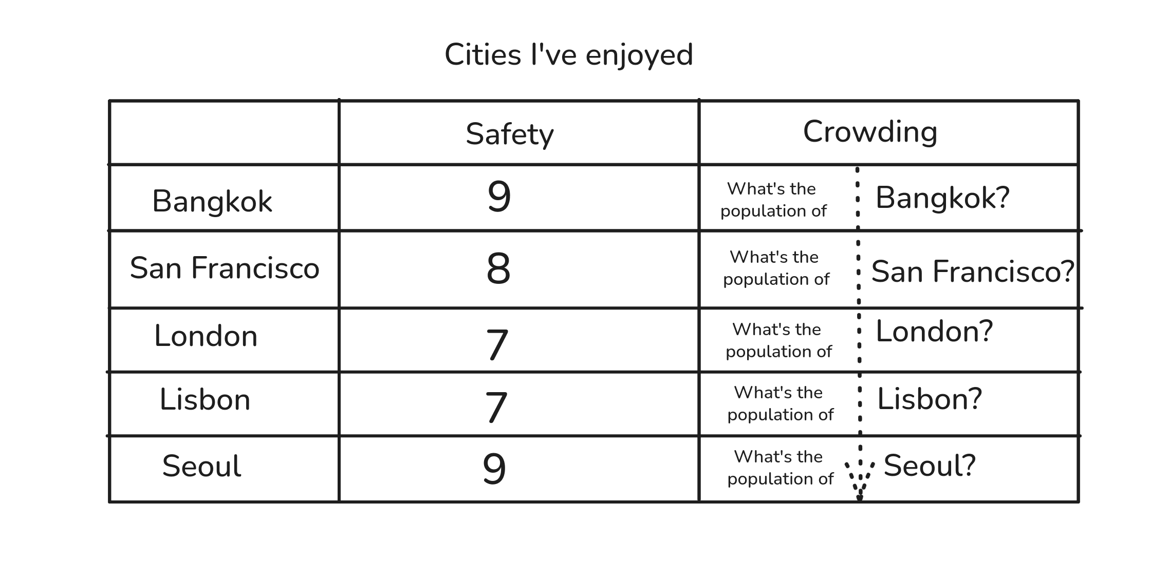
Here's a list of my 5 favorite cities:
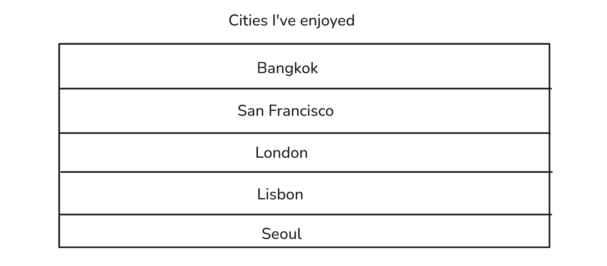
Look what happens when we turn this into a matrix, even with just one column.
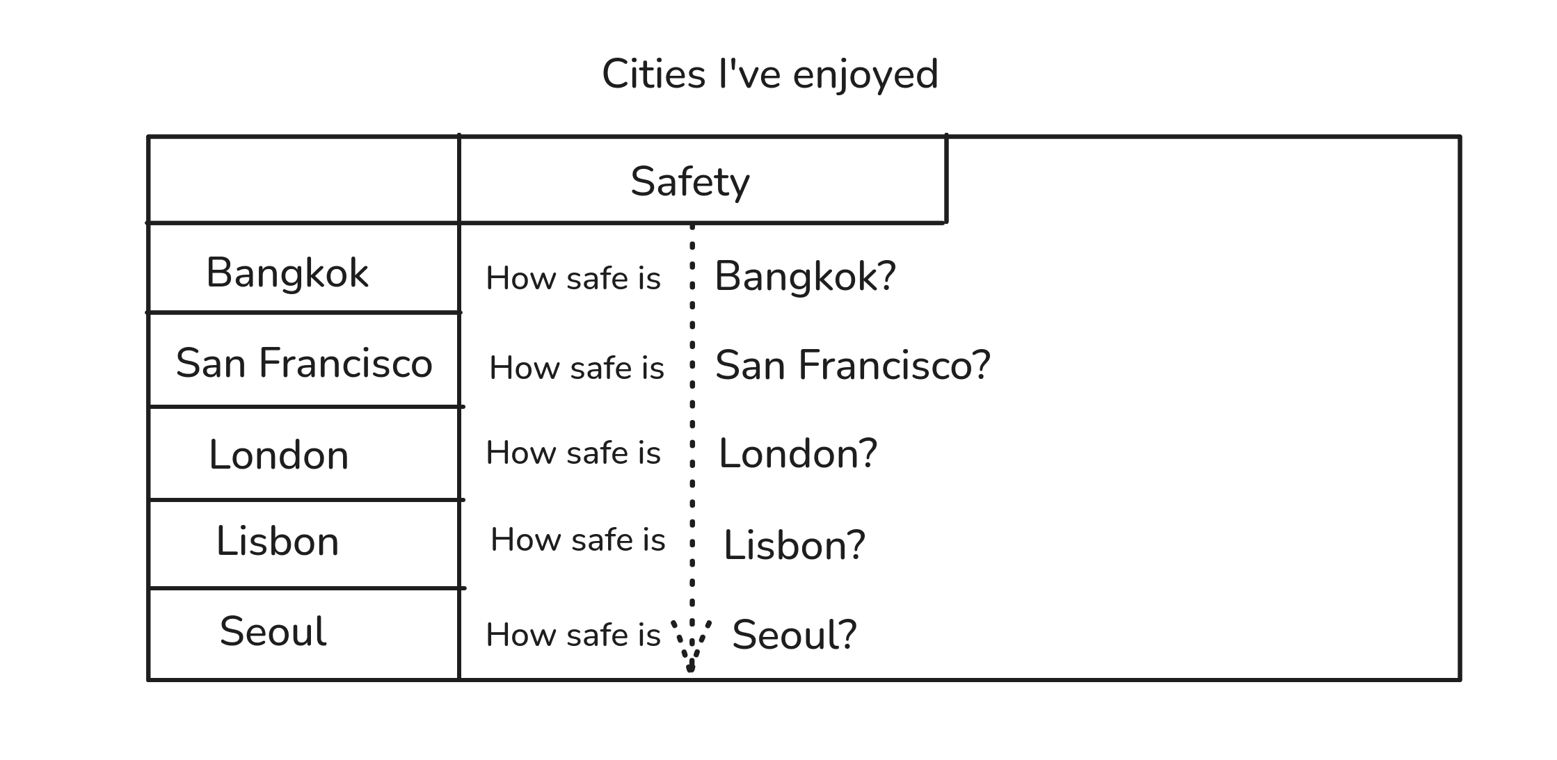
The same simple relationship is repeatedly applied but with different things.
And the more columns we add, more simple relationships are repeated.
This is where the creative problem-solving juju kicks in: a matrix forces us to visually represent something complex by combining simple, repeating relationships.
And what is a simple repeating relationship?
A pattern.
And because we may be able to explain and predict things in a pattern, and because the matrix combines multiple patterns, we might be able to predict new values for multiple patterns and combine them to form creative options.
Proven patterns + but with new values = creative options.
I call this form of creativity (and yes, I'm delighted to announce to the human race that no AI had a role to play in this idiocy of naming) Combinatorial Creativity.
Let's see how it works in practice.
§04
How to combine patterns to make new things
Step 01: We need a spreadsheet.
Step 02: We need a category of things to focus on.
This is any kind of task or group of things we want to creatively contribute towards.
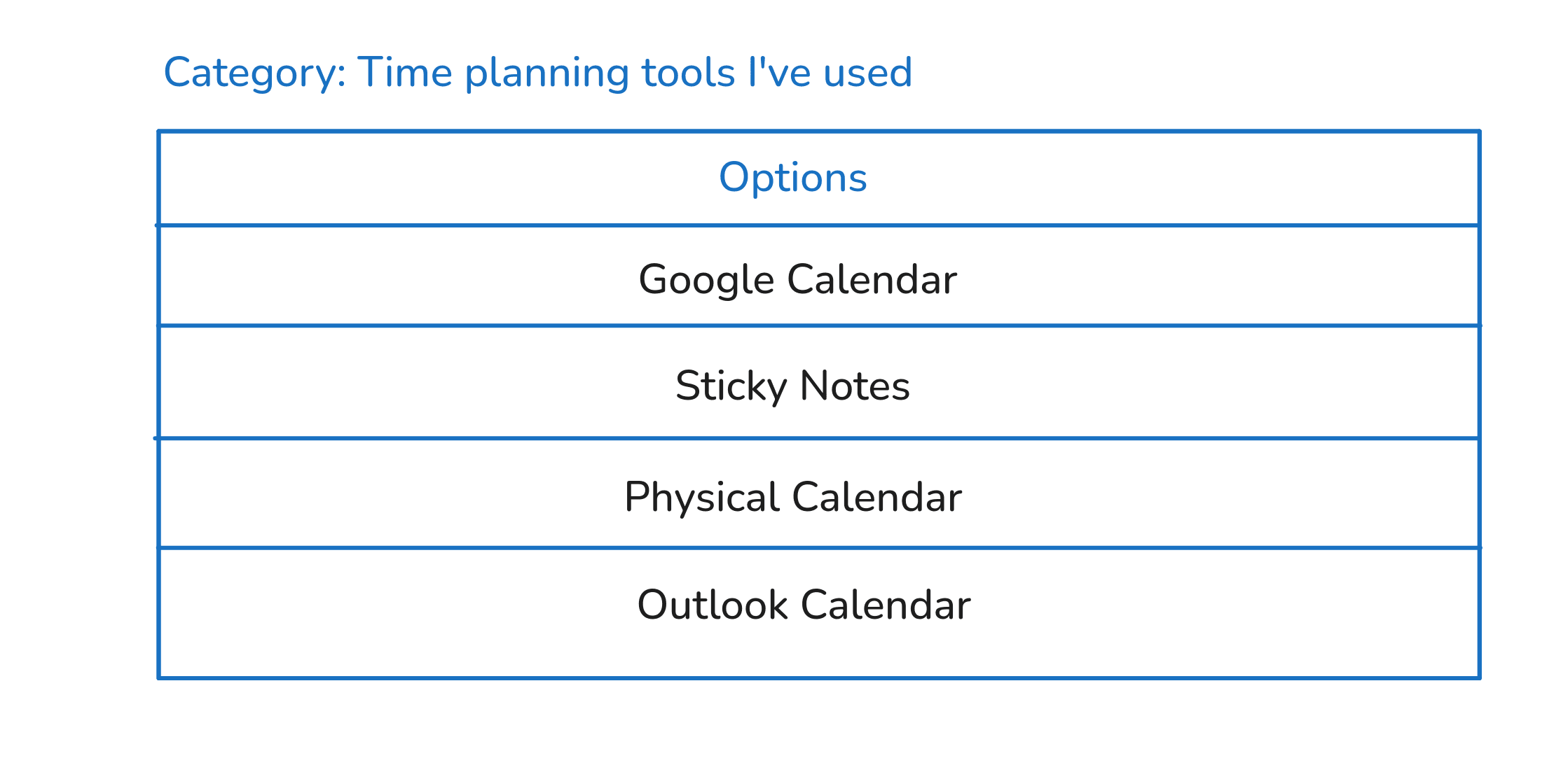
For our time planner, we'll label our category like so:
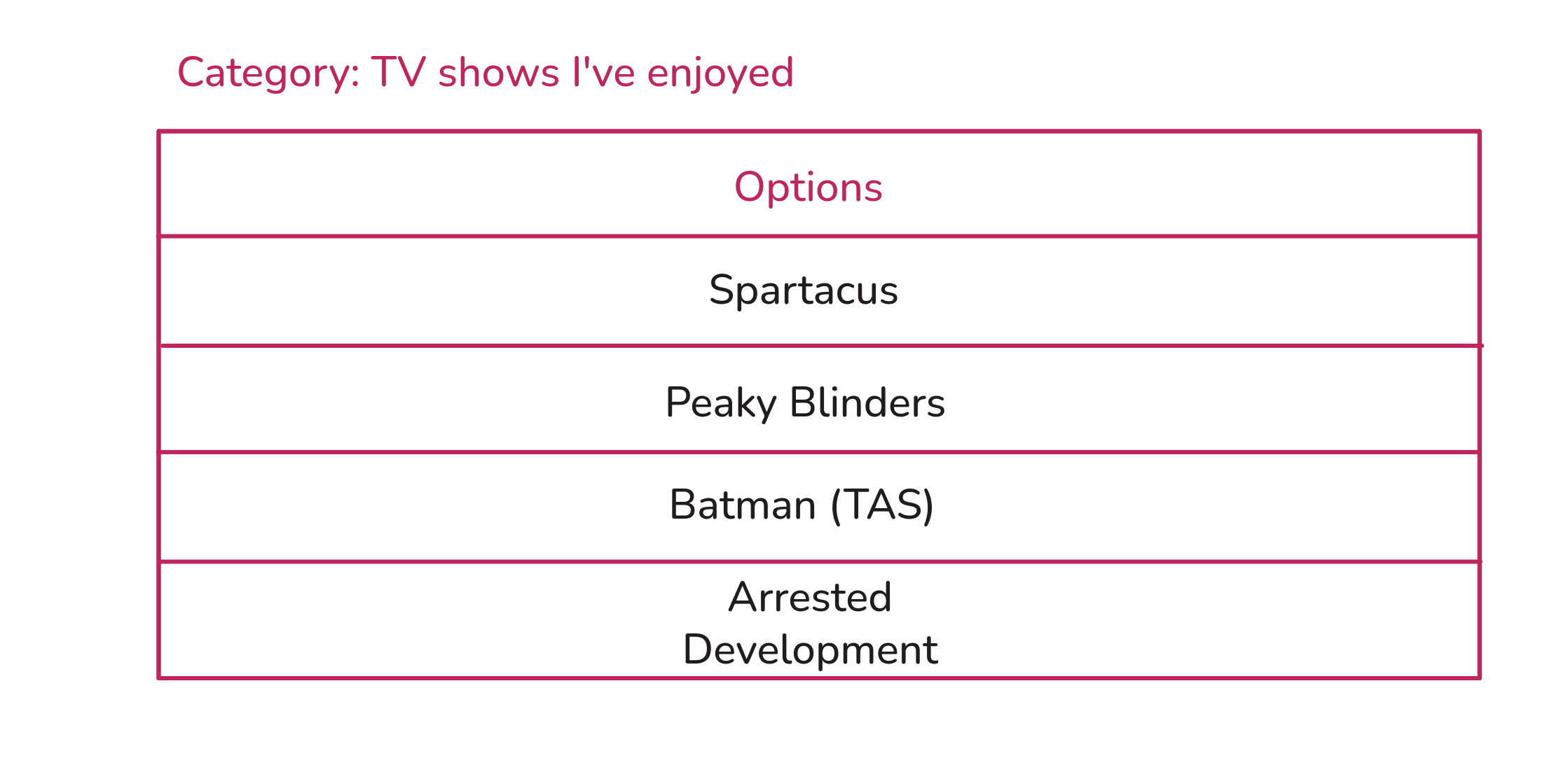
For our television show, we'll use this:
Step 03: We need things that belong in the category.
We don't need all the data in the world, just enough variety to visually spot patterns. 5-10 is a good number but for our examples we'll use 4.
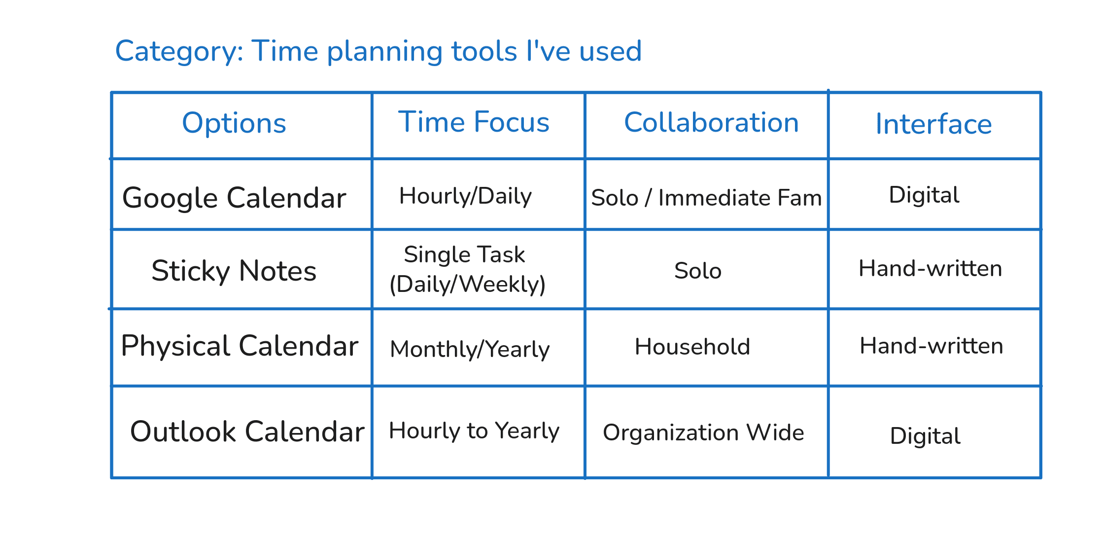
Step 04: We need to try and name recurring patterns that exist across the options.
5-7 patterns seem to work well for me but for our examples we'll pick 3.
(I'm going to do something here that will intentionally make our life harder in the final step. Can you sense that something is off in the 'tone' values I use for the TV shows?)

Step 05: We need to visually scan for patterns.
In this guide, because we're not looking for some general universal truth, but only to generate creative options, we'll focus on one pattern at a time and then later combine them to make creative options.[Note 1]
You know you've found a pattern if you can use either of these two techniques:
a) Interpolation: find values that have been skipped or overlooked.
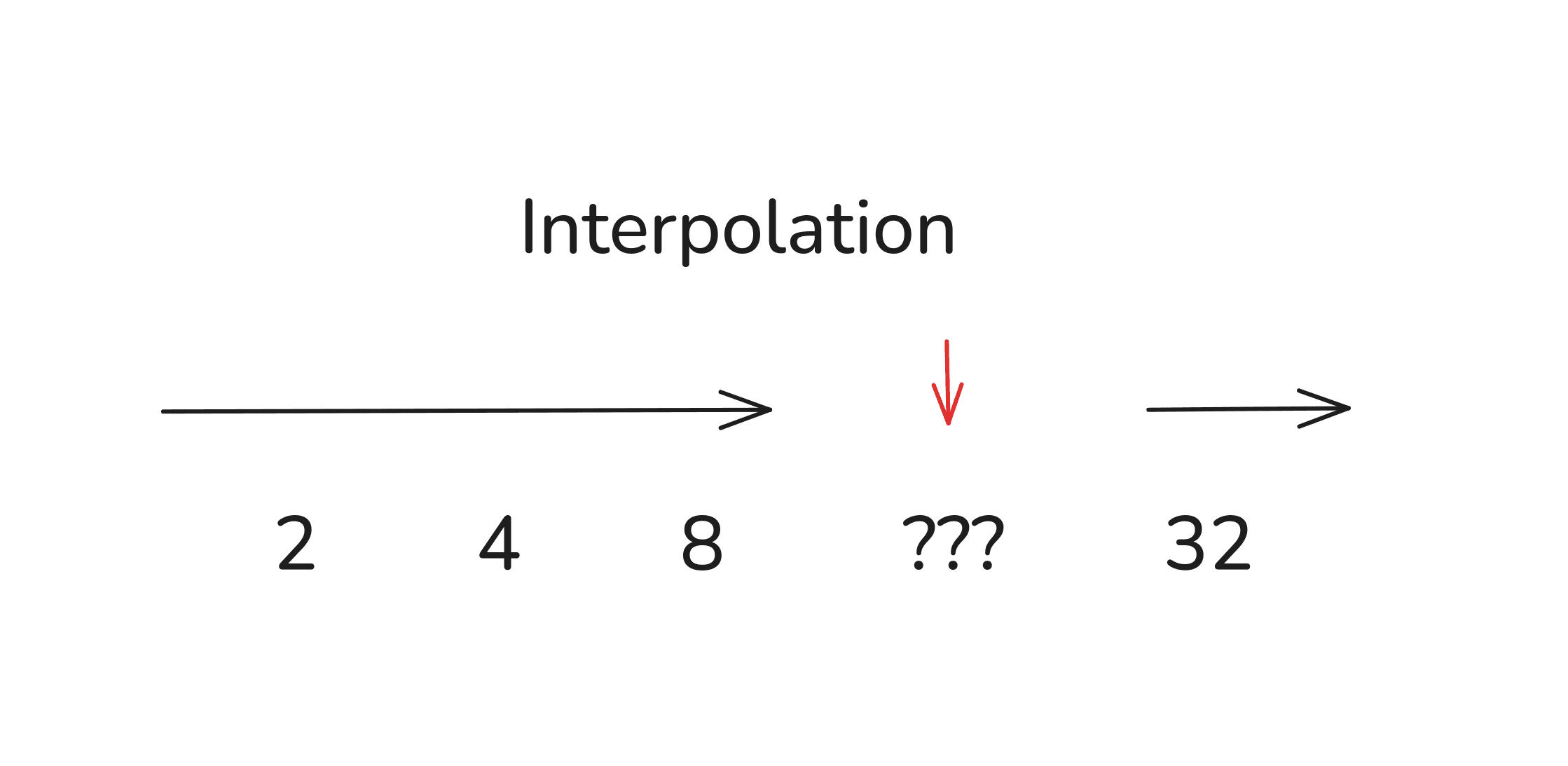
Maybe 16 would work well here?
Could there be something in between those values?
b) Extrapolation: find values that have not yet been explored.
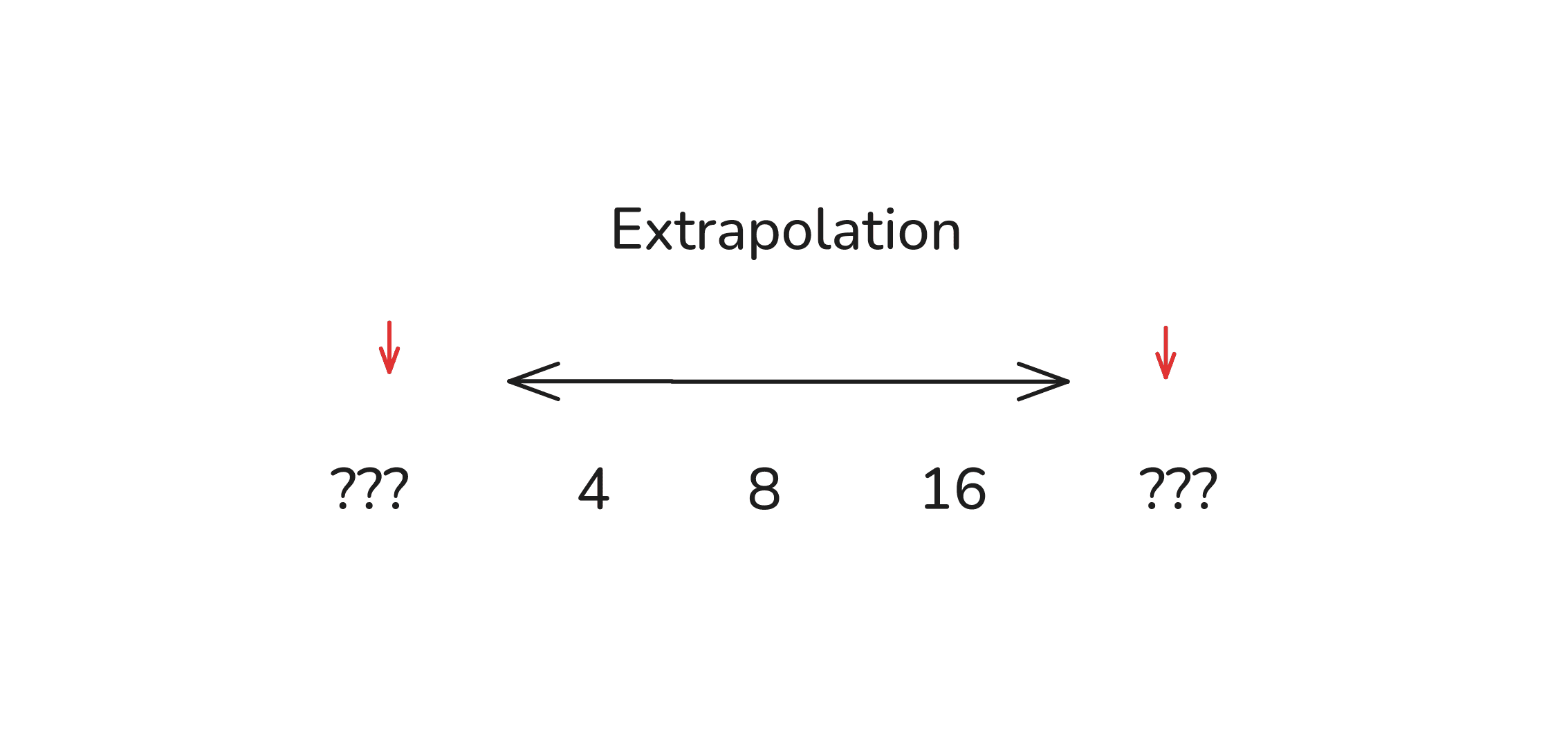
Maybe 2 and 32 would extend this pattern?
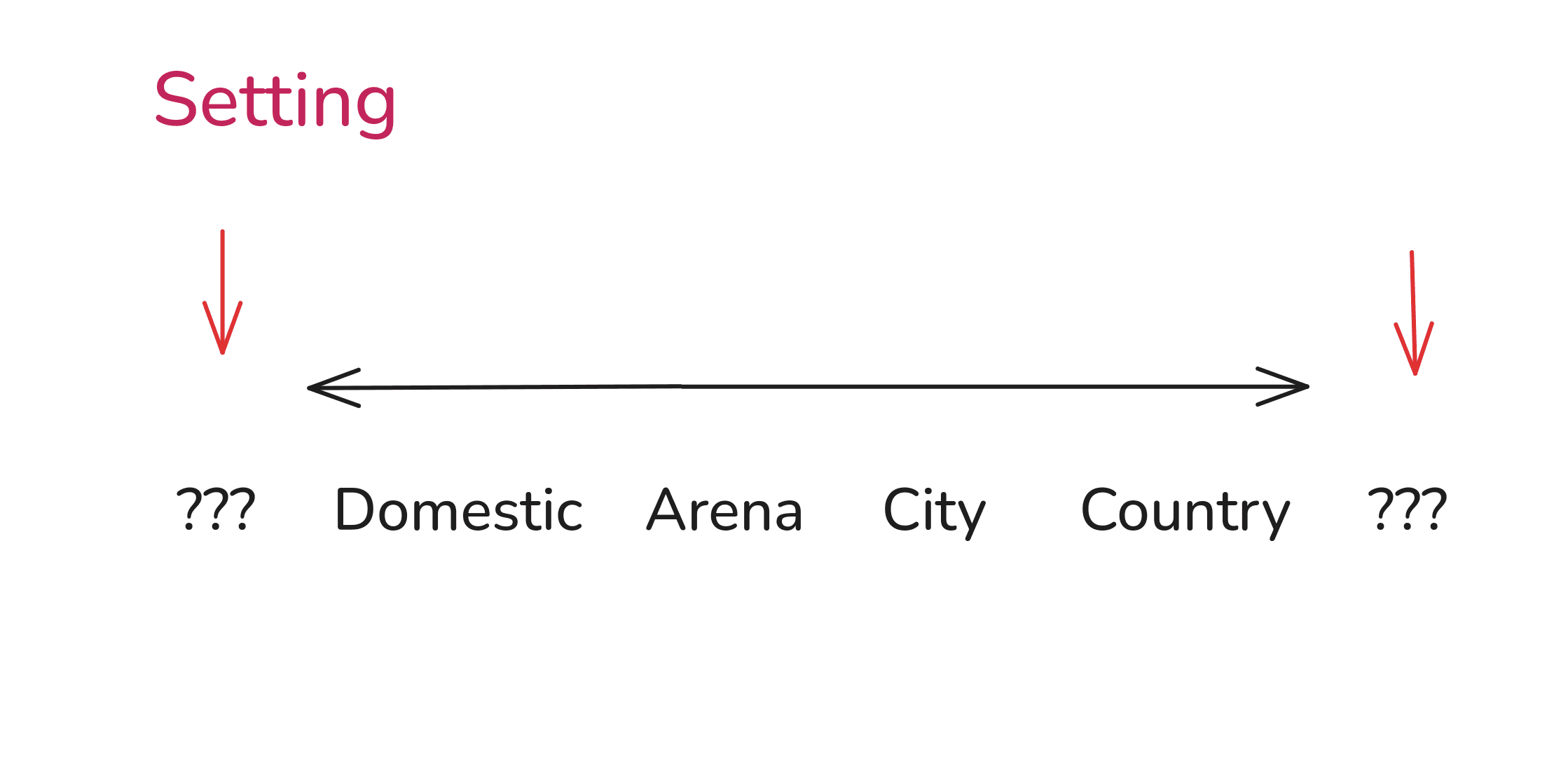
Where does the 'Setting' pattern begin and end?
We'll use these simple ideas to play with patterns and generate new values.
But you don't need new values, really. The key is combining values creatively.
Step 06: We need to combine patterns to generate new options.
Even before you do any kind of pattern detection, you can simply take values that have never been combined together and create something new.
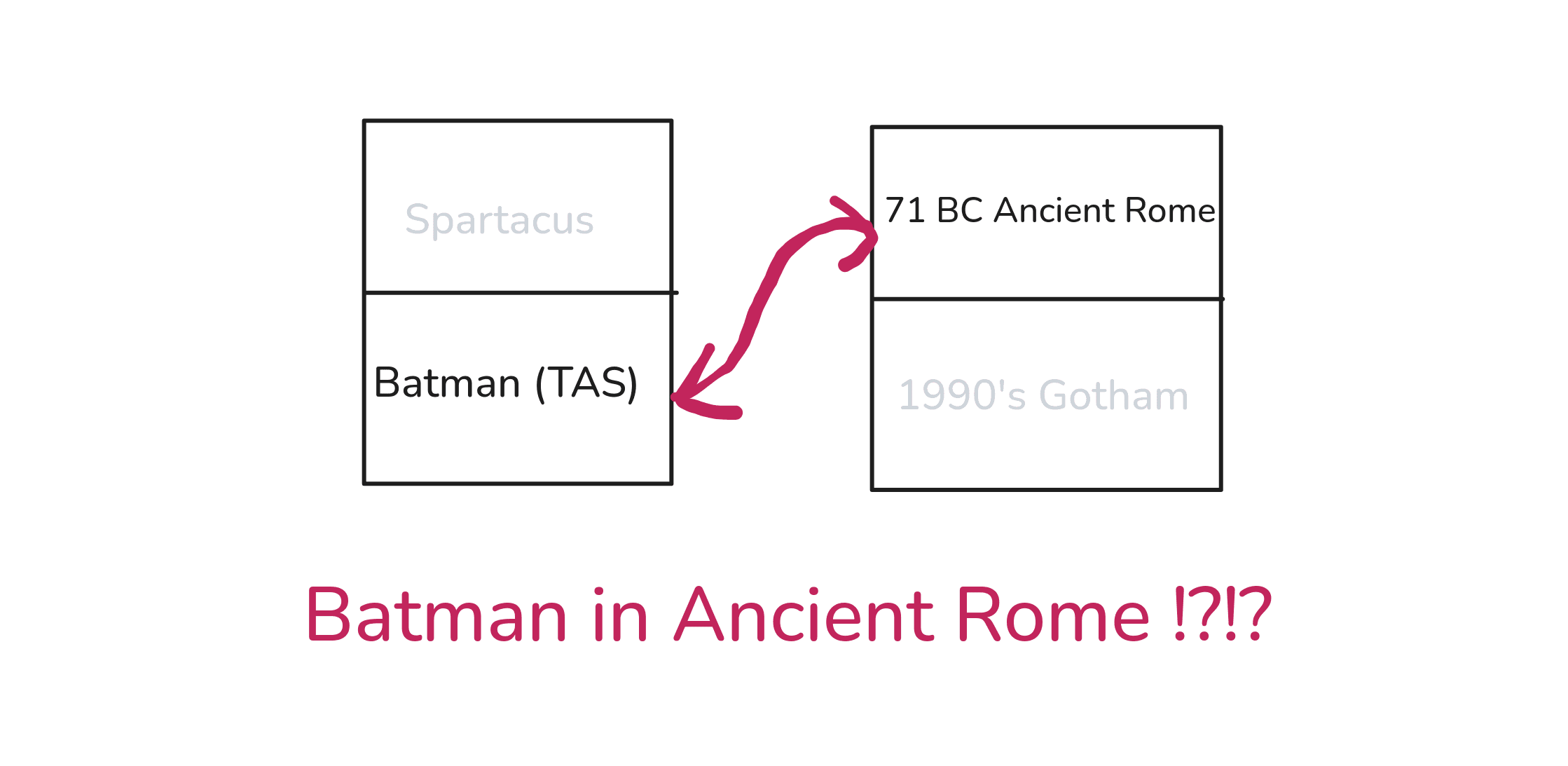
A rich orphan in Ancient Rome who fights crime wearing a mask, a cape, and riding a black horse? What kind of crime groups existed back then? Doesn't even matter, I'm already in.
Still, let's continue and do some pattern hunting.
First, for the time planning application. This is what our spreadsheet looked like:

Here, the patterns were somewhat straightforward to play with.
And so,
Fridge Door Planning
This is a creative combination I liked:
- Sticky NotesRe-used
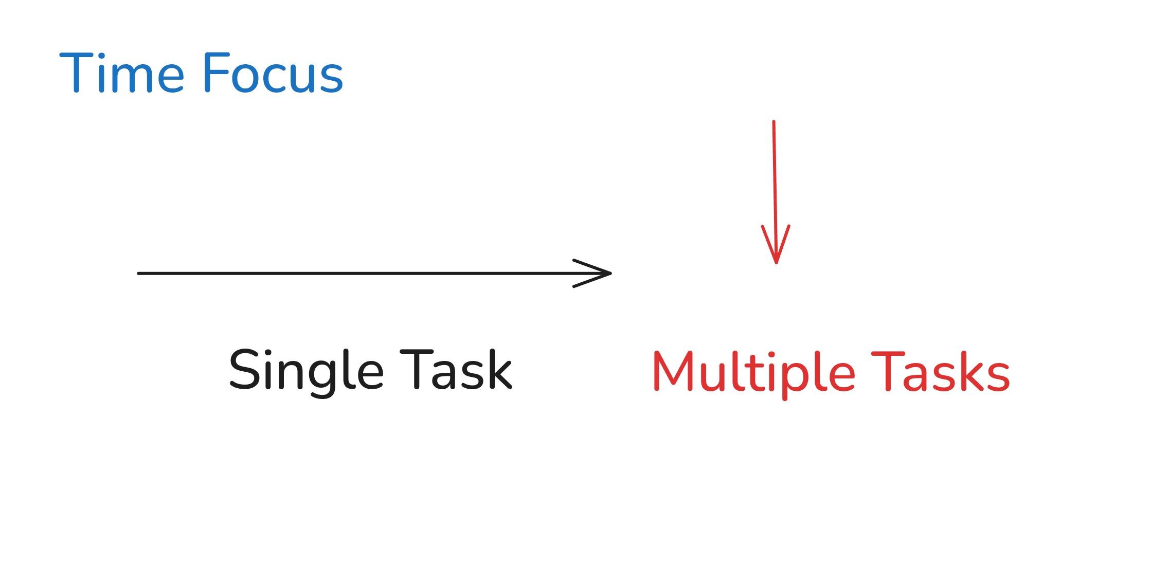
- Multiple TasksExtrapolated
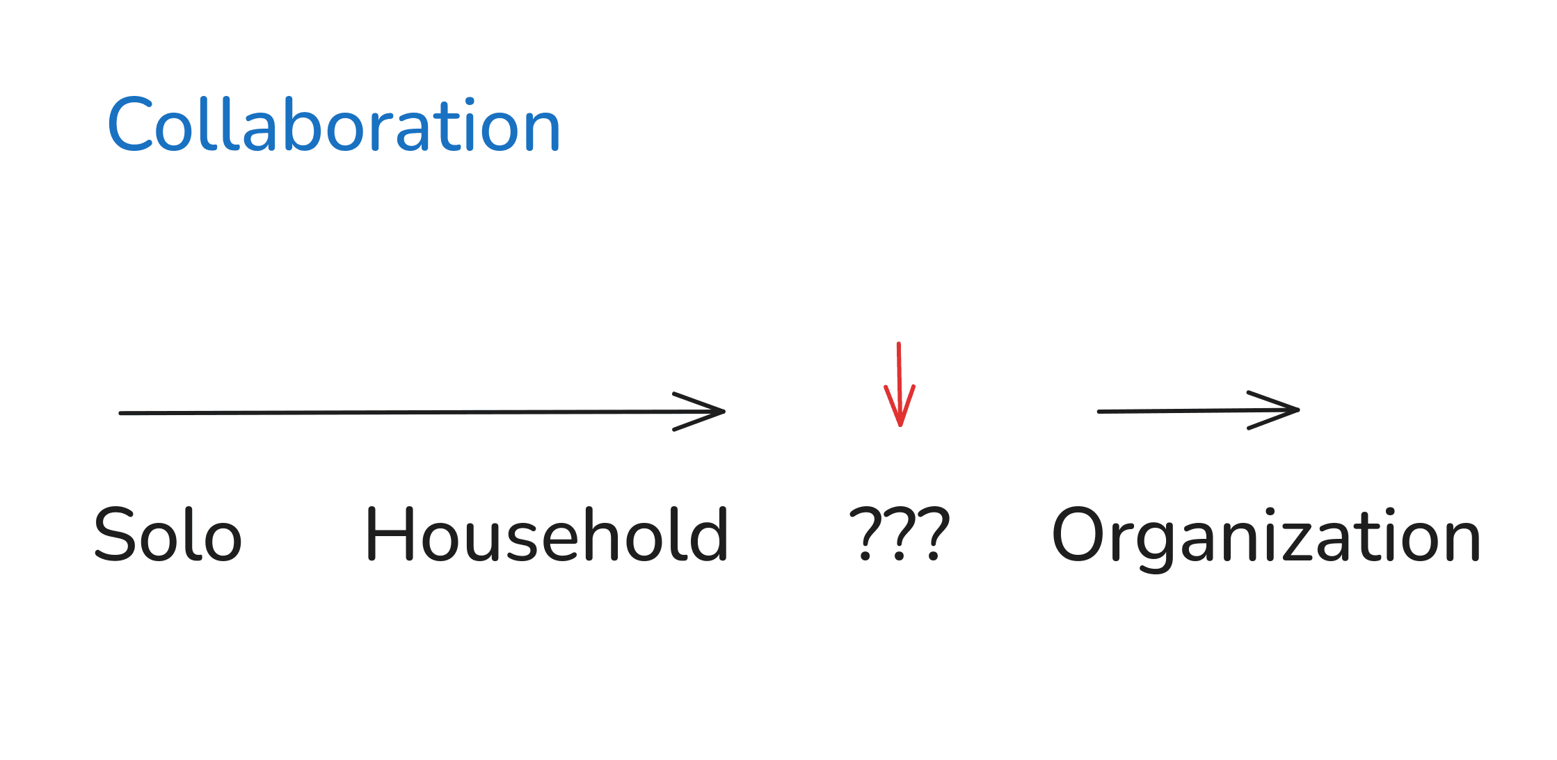
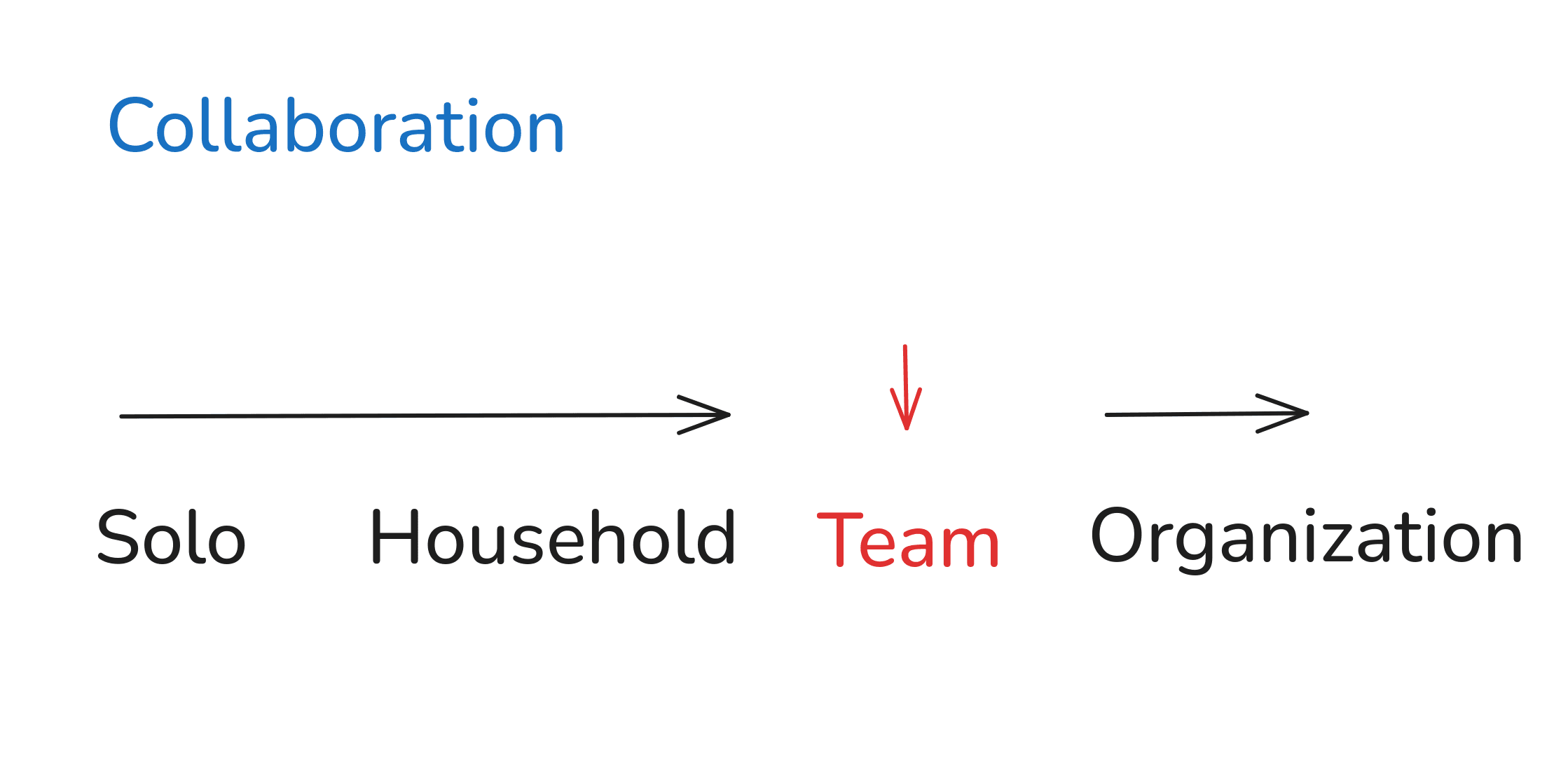
- Small TeamInterpolated
- Digital InterfaceRe-used
Because it suggested this idea:
A collaboration app for a small team (3-5 people) that uses just one screen (fixed-size canvas) and digital sticky notes.
No menus, no workflows, no tags, no special buttons.
They remove, edit, add new sticky notes as they work. Everyone sees everything all in one screen. The canvas has a fixed size, so it's everyone's job to keep it clean.
If it's cluttered, the team needs to stop and talk.
It's a digital fridge door for your team.
What if we extrapolated the 'Time Focus' pattern to include decades and centuries? Could that be useful for a family planning or community planning tool? Maybe. But I'm happy with the digital fridge door.
Now for the problem I've planted for us.
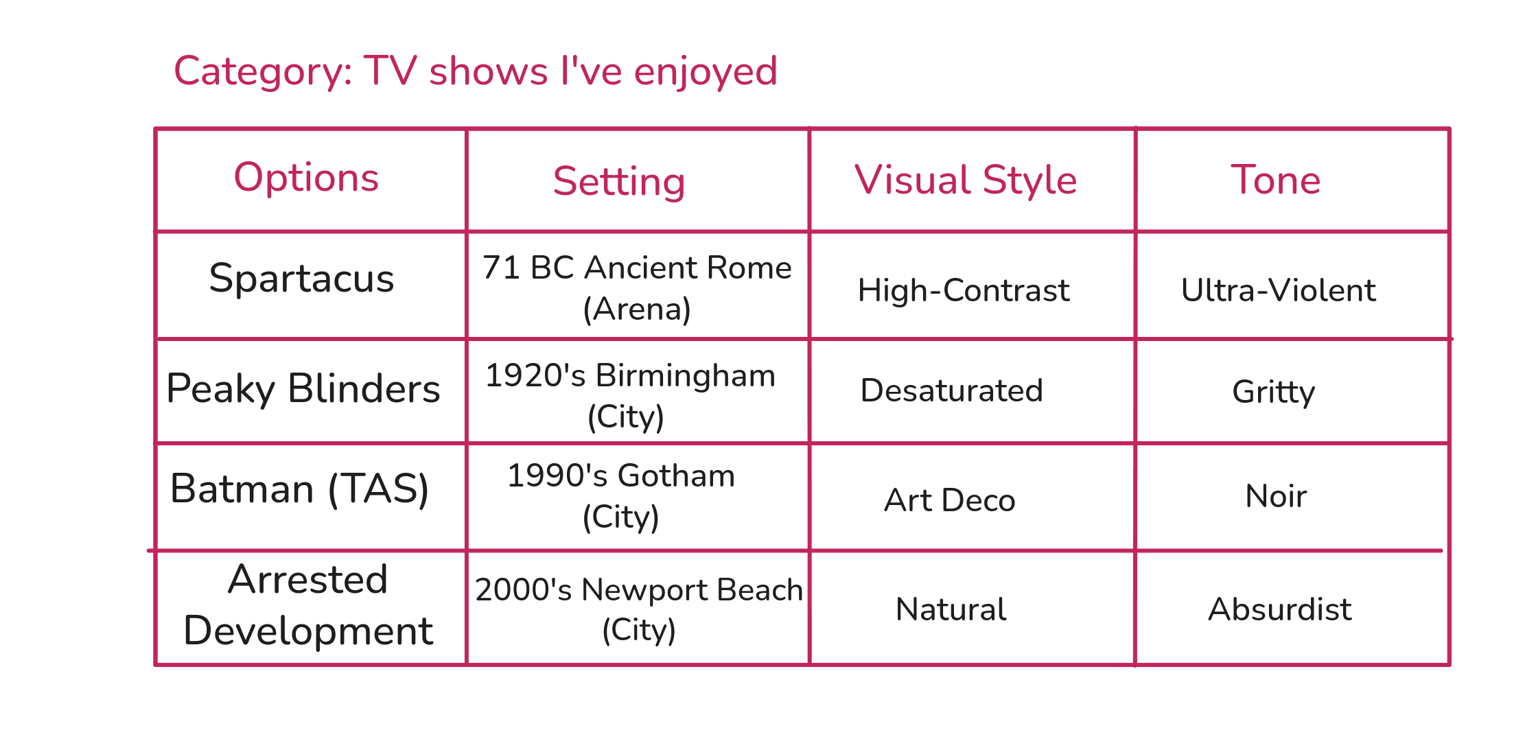
This is the spreadsheet for the television show:
To show you what's wrong, let's first look at a pattern that has no problems: The 'Setting' pattern.
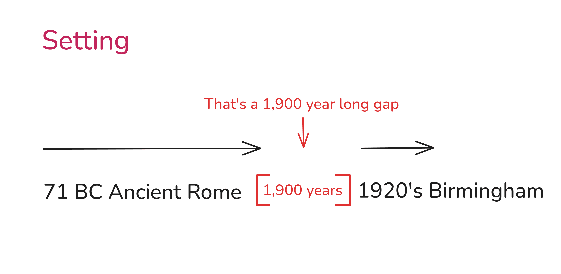
Let's pick the midpoint between 71BC and 1920 AD. That's 925 AD.
The Byzantine Empire was up and running back then so I think this is an interesting value: Constantinople 925 AD.
Ok, that's fine. I like it.
Now, for our problem.
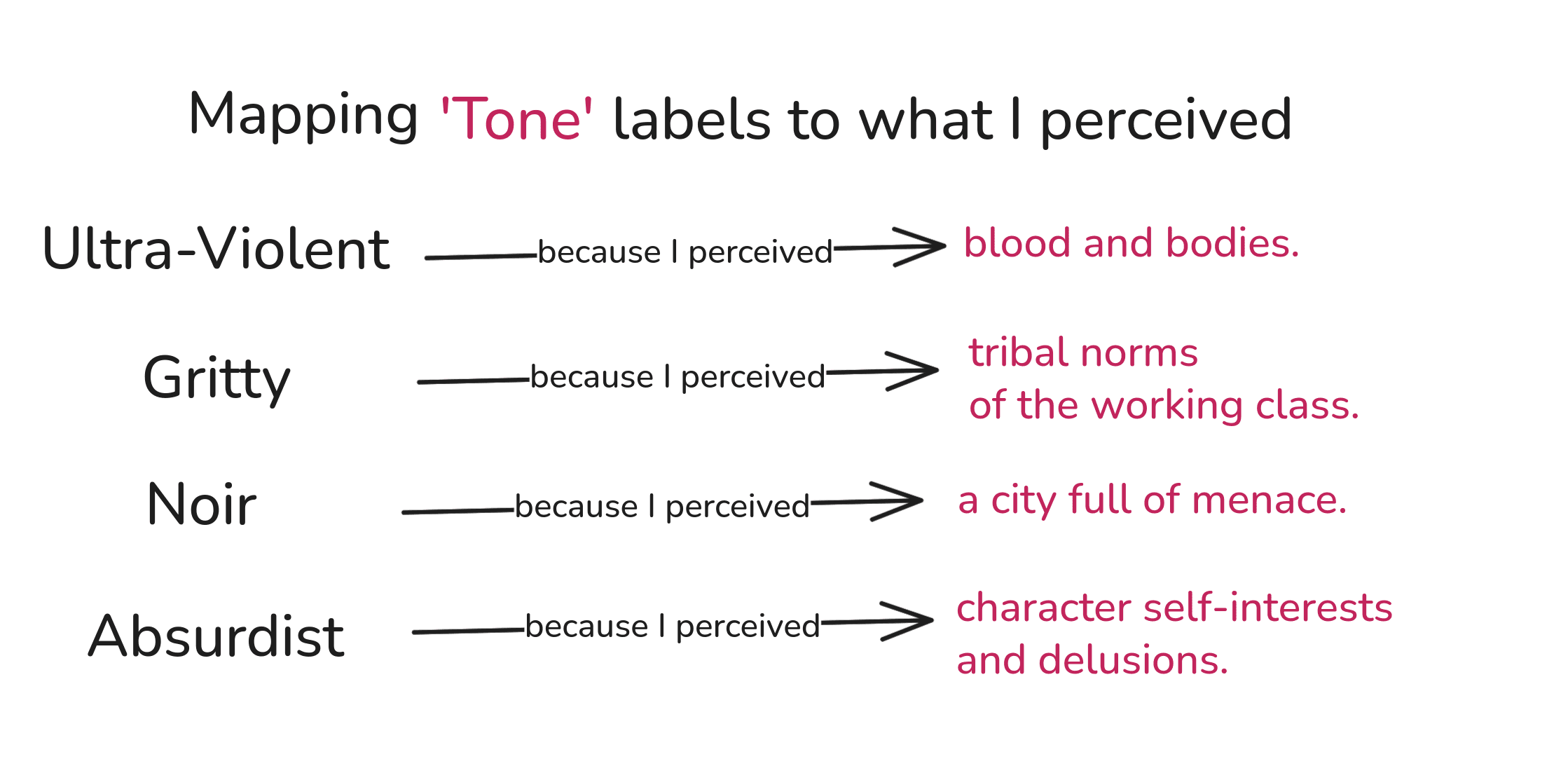
I listed 'tone' as a recurrent pattern for television shows. And I think I'm right, TV shows all do have a tone value to them. But look at my values: Ultra-Violent, Gritty, Noir, and Absurdist.
What pattern do they form? What relationship are they repeating? Do they suggest any missing values or unexplored values?
I don't see any. How are 'Ultra-Violent' and 'Noir' on the same spectrum?
This is a problem you'll run into often. I used labels and terms that are popular and that have some meaning, but don't necessarily help form or suggest a pattern.
Thankfully, the fix is easy.
When we can't spot a pattern, but we know a pattern must exist, all we need to do is: rephrase values in terms of a relationship to something specific.
Remember, a matrix is built from repeating relationships.
All the different 'tone' values must be different but of the same relationship.
Let's fix what I mean by 'tone':
Could this be a pattern?
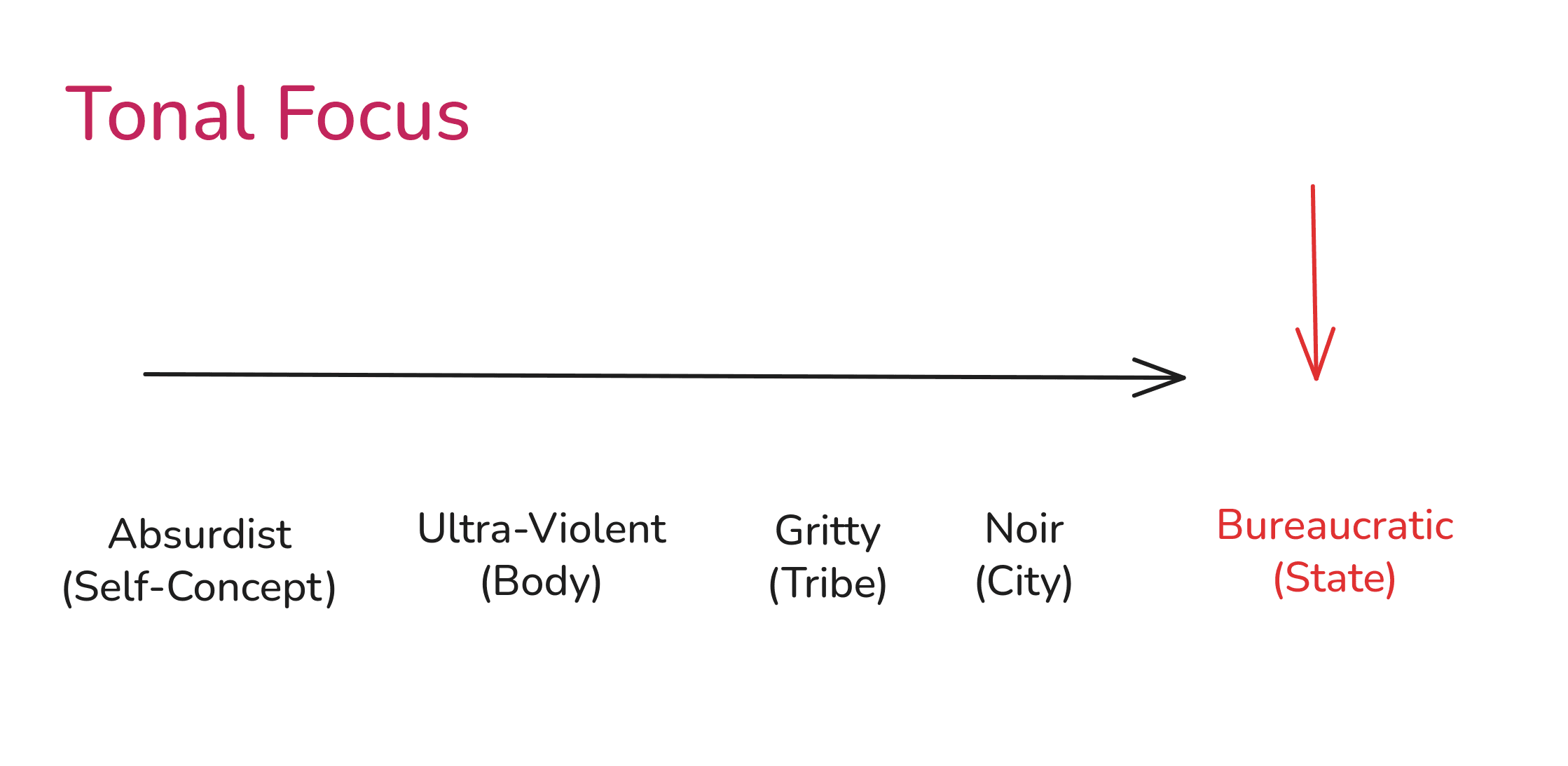
Have you ever seen a television show with a 'Bureaucratic' tone? Maybe something like 'Yes Minister'? Maybe.
I think that's interesting.
What a constant nope hole
This is a creative combination I liked:
- Arrested DevelopmentRe-used
- Constantinople 925 ADInterpolated
- High-ContrastRe-used
- BureaucraticExtrapolated
Because it suggested this idea:
Three brothers in the Byzantine army.
- One brother stressed and highly ranked.
- Another brother content and low ranked.
- The last, kicked out the army for failure and embarrassment.
Careers that go nowhere. Love that can only be bought. Join them as they try to navigate family and life in the empire.
World getting too confusing? Well, at least it's not Byzantine.
Do I like it? Sure! It's something.
In practice, you'll have more patterns, more options, and many more possible combinations.
It's incredibly powerful to have this kind of process that allows you to quickly build 5-10 creative options, especially because you can explain them using existing, proven patterns.
§05
A prophecy for you
That's it, reader. That's how to use a spreadsheet for combinatorial creativity.
It doesn't eliminate the work required to create something, but it does support the quality and quantity of creative work. I think that's a rare combination of benefits.
I hope it seemed neither complex nor confusing. If I had to explain all of this to a 5 year old, I'd say: 'make many new things by looking at many old things'.
The spreadsheet just makes it easy to keep track of what options you have by showing you the patterns you've noticed. It is after all, a matrix.
And I have a sneaking suspicion, a feeling if you will, dear reader, …
… that you're the one.
- I write about how we can use language to make things happen.
- I have no fixed writing schedule.
- And I reply about ..uhhh.. 30% of the time.
Also, I love you. Maybe. Very lightly.

Notes
Note 1
Mendeleev wanted to organize and explain the whole list. That meant looking for patterns between patterns. You can still do that visually by isolating 2 columns at a time and seeing if you can spot a pattern between the two columns. I didn't show this in the guide for brevity.
Note 2
To see how I use a spreadsheet while marketing, see How do copywriters study a market?
References
- [1]
Gordin, Michael D. A Well-Ordered Thing: Dmitrii Mendeleev and the Shadow of the Periodic Table. Revised edition. Princeton, NJ: Princeton University Press, 2018.